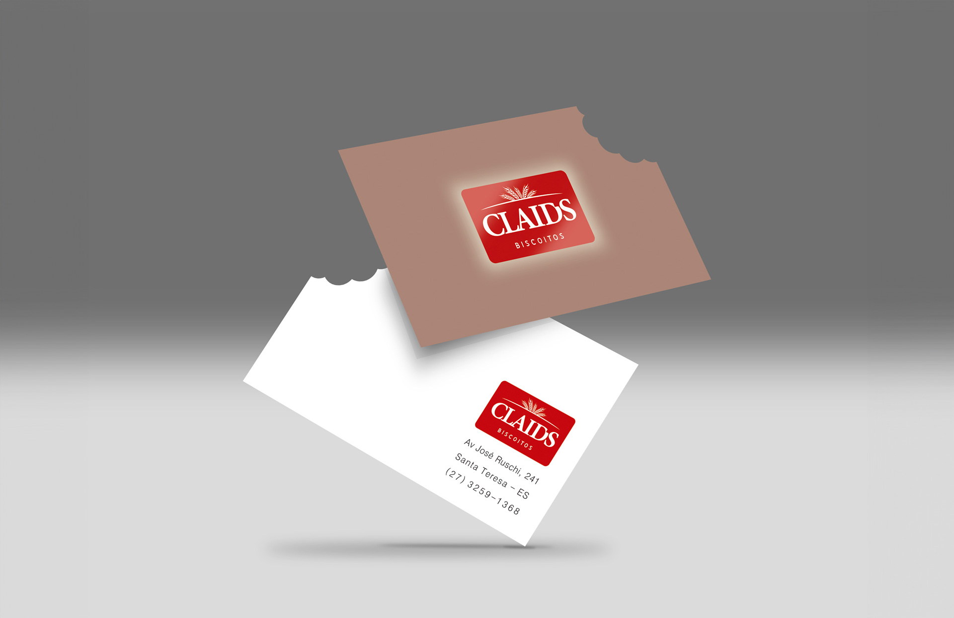
This project involved the creation of a complete and cohesive brand system for Claids Biscoitos, covering logo design, packaging, signage, and store design. The visual identity was developed to communicate tradition, quality, and craftsmanship, core values of the brand. The logo combines classic typography with wheat-inspired elements, directly referencing artisanal production, while the red color palette ensures strong visibility, warmth, and brand recognition.
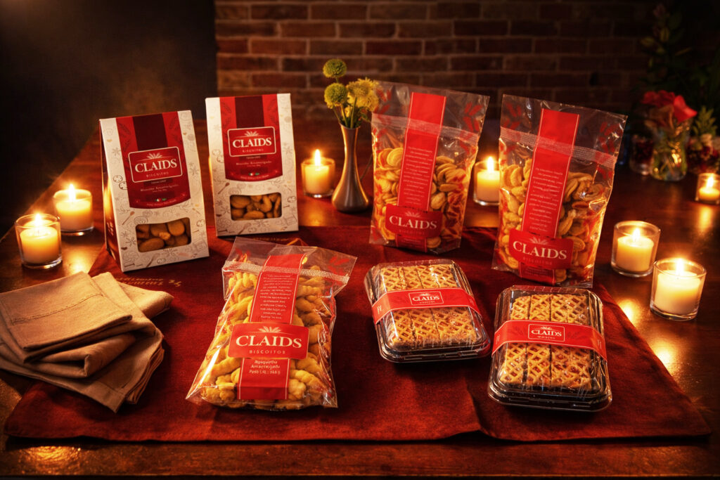
The packaging design balances visual impact with product transparency, allowing the biscuits to be seen and reinforcing freshness and handmade quality. Branded bands and labels create a flexible and consistent system across different product lines and formats, from everyday items to gift-ready solutions, ensuring scalability without losing identity.
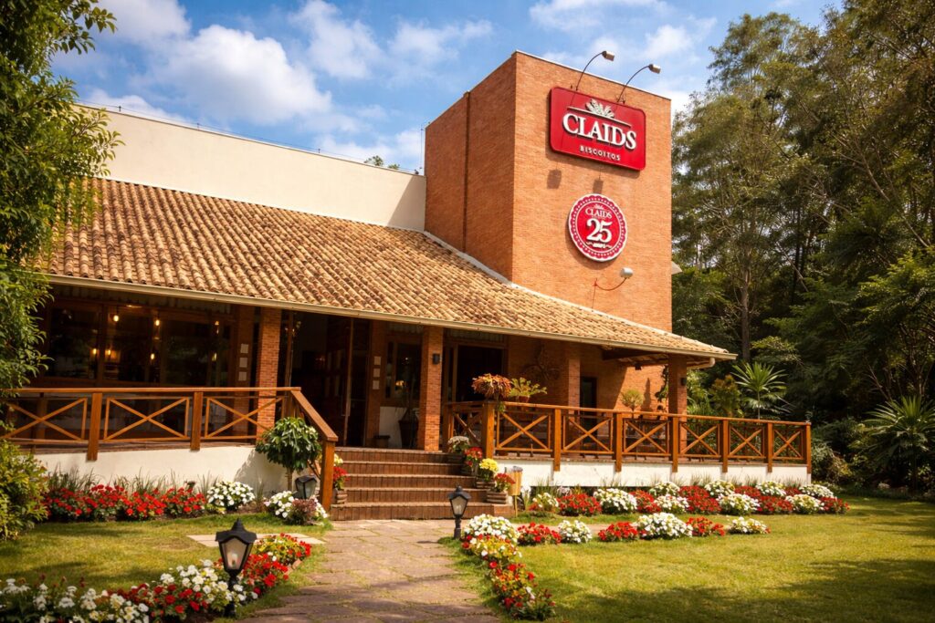
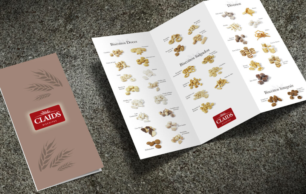
The retail environment and signage extend the brand experience into the physical space, creating a welcoming and well-organized store that enhances product presentation and customer flow. Together with coordinated materials such as brochures and business cards, all touchpoints follow a unified visual language, resulting in a strong, recognizable brand presence that positions Claids Biscoitos as a reference in artisanal quality and tradition.