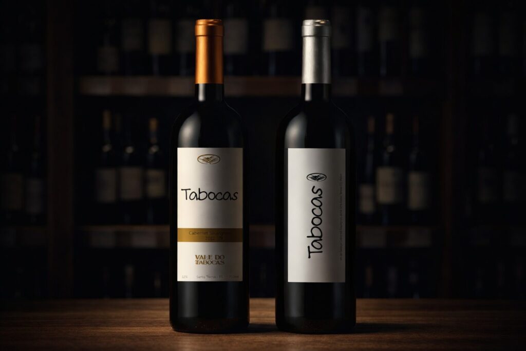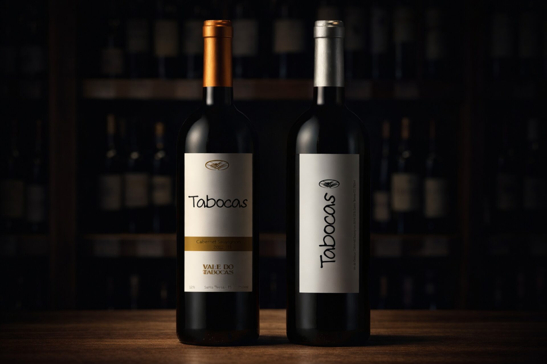
For the Tabocas project in the wine sector, we developed a label design aimed at enhancing the product at the point of sale and strengthening its brand identity.
The intervention focused on an essential and elegant visual language, capable of communicating quality, authenticity and artisanal care. Typography, proportions and information hierarchy were carefully studied to ensure immediate recognition and clear readability, maintaining a balance between winemaking tradition and contemporary sensibility.
The project included the development of multiple label variants, ensuring visual consistency and application flexibility. The goal was to create a restrained yet distinctive graphic system, able to stand out on the shelf without excess, allowing the wine itself to remain the true protagonist.
The result is a label that resonates with the premium wine context, reinforcing brand positioning and supporting its commercial presence with a strong and lasting identity.