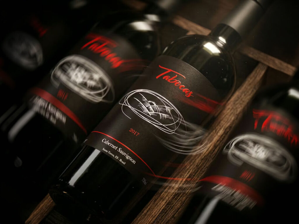
For Vale do Tabocas, we developed the label design for the 2016 and 2017 vintages, creating a coherent visual dialogue between two expressions of the same harvest, able to convey both continuity and distinctive character.
The project explored the balance between restraint and expressive strength, maintaining a shared identity while differentiating the labels through complementary graphic languages. Illustrations, typography and the controlled use of color were carefully designed to enhance the wine and reinforce its presence within a premium retail context.
The goal was to create a recognizable, elegant and timeless visual system capable of supporting the brand’s evolution across different vintages. The result is a design that communicates quality, authenticity and artisanal care, strengthening Vale do Tabocas’ positioning through a solid and consistent identity.